2016
Lotus
Lotus is a native iPad app for drawing in real-time with others. It recreates the experience of drawing on the same whiteboard with others and is built for the Apple Pencil.
I worked with two engineers and took the app from sketches at a hackathon to launch on the iOS App Store. I worked on everything from branding the app to designing all interactions and even building parts of the UI using Swift.
MY ROLES
Interaction Design, Branding, UI Engineering, Marketing
COMPANY
Self-Started
Pencil Dreams
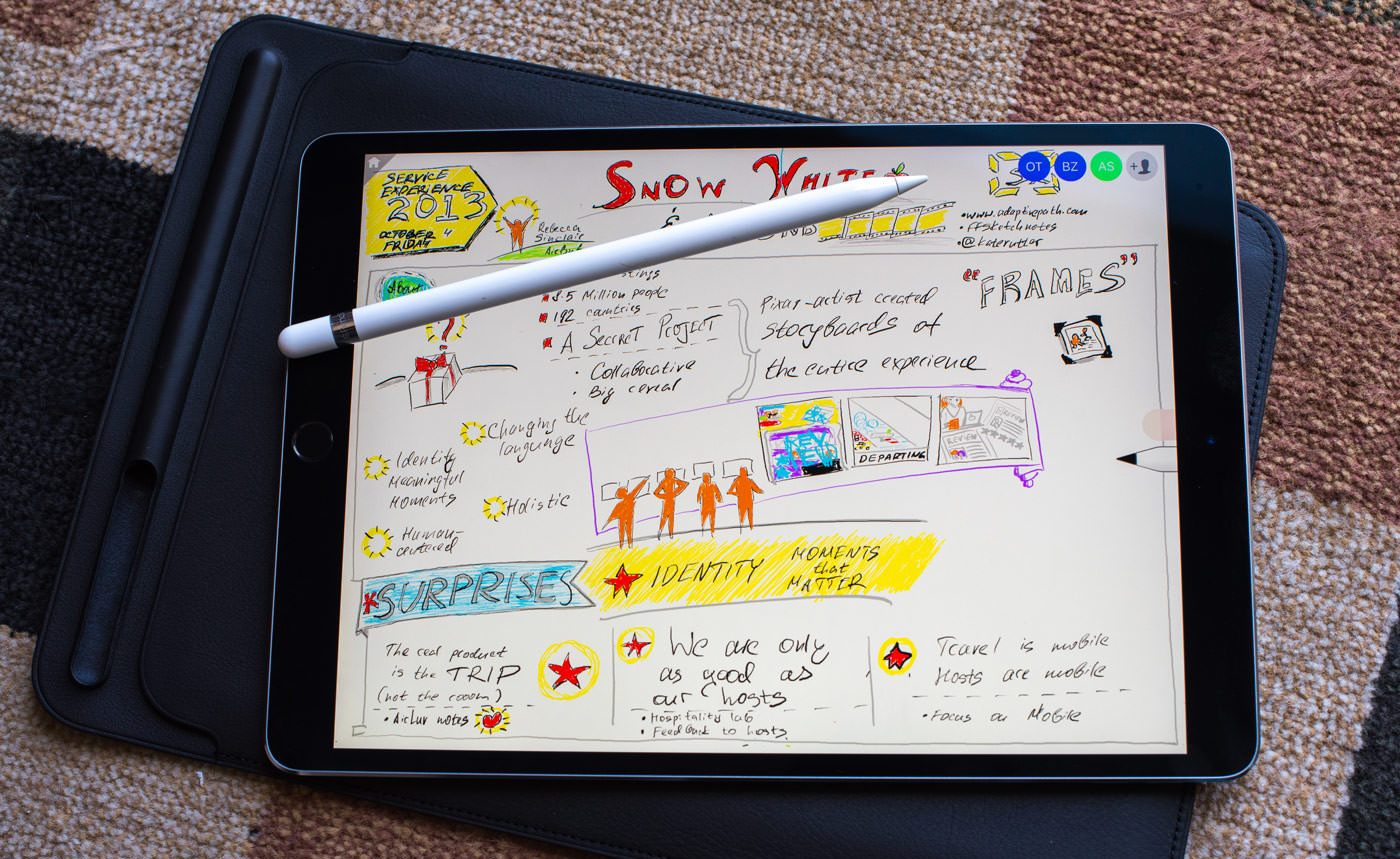
I am a huge believer in the iPad. Back when people said the iPad was a toy meant only for consuming media, I was using it for sketching and painting. Things didn't get really exciting until the iPad Pro and Apple Pencil combination launched.
Yet the iPad was still only a tool for me to use alone and not with others. I work on a daily basis with people from all around the world. There really were no great ways of matching the experience of standing around a whiteboard and sketching out ideas together. This was the inspiration for Lotus, a side project I started in the spring of 2016 with two software engineers.
Hacking a Prototype
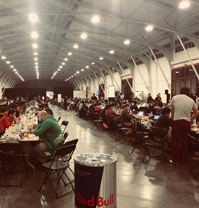
A few weeks after we decided to build a real-time whiteboard app, the LAUNCH Hackathon was held in San Francisco. Over the course of 48 hours, we took Lotus from sketches to a working iOS app running natively on the iPad Pro. My primary roles during this time were to conceive the user experience, design the logo and brand identity, and build key parts of the user interface on the native hardware. This was a great opportunity for somebody like me who works a good chunk of the time with wireframes and sketches. I learned enough Swift to be dangerous.
On the final day of the Hackathon, we demonstrated Lotus to the judges. They were blown away by the fact that the app worked, even with the poor wifi coverage of the Fort Mason pavilion. We made it through two rounds of judging. After the hackathon, we agreed that we wanted to launch the app publicly.
Another drawing app wouldn't be anything special.
When you are in different rooms—or in different time zones—and see your friend's pen strokes in real-time, it's magical.
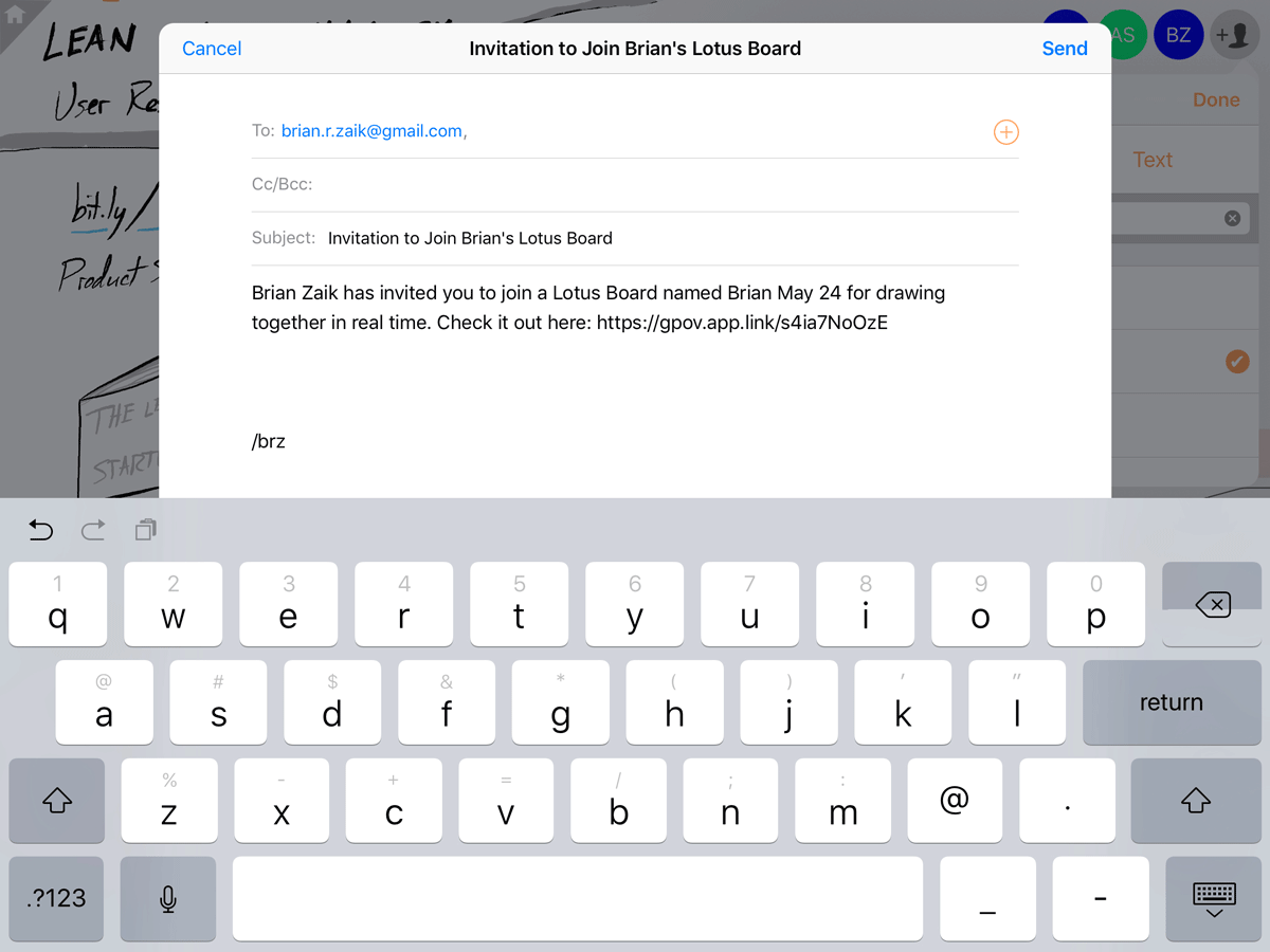
To persist and share these pen strokes across the Internet, we turned to Google Firebase and implemented a simple caching mechanism to store strokes locally on the client. I tried to keep the synchronization with Firebase invisible. Pen strokes were always saved locally to the device in case something happened to go wrong with the network connectivity, and I designed a simple indicator for when the device is offline. We included a basic flow for inviting others to your boards via the iOS Contacts list and opened up sharing of boards via iMessage and SMS.
Before & After
Boards Gallery
Lotus has a very flat and simple information architecture. We settled on a simple home screen grid of whiteboards, each showing a name and a thumbnail preview. I preferred this presentation instead of a flat list because I felt that without the thumbnails users would have to repeatedly go back and forth to distinguish the boards visually.
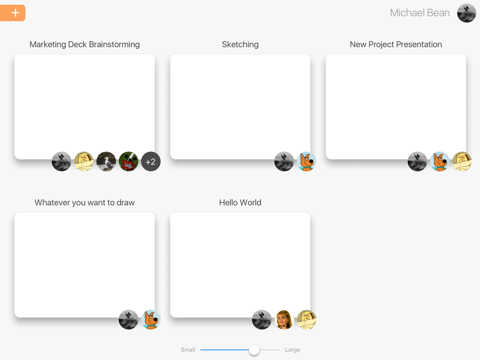
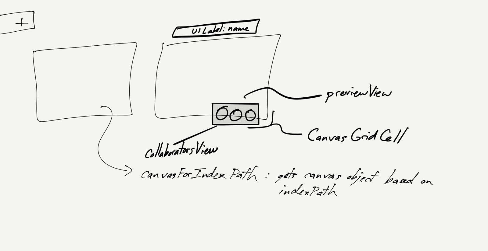
Before & After
Canvas
We had to figure out whether each board would have multiple pages or layers. I felt a fixed size canvas with just one layer per board would be easiest to understand, especially as we planned on integrating a full history to allow people to go backward and forward in time if they wished. Having this history impact multiple pages within the same board at the same time would have made the experience overly complicated.
The final issue to work through was loading. As people worked in real time, their strokes would be saved over the Internet to Google's Firebase cloud service and then downloaded locally on the devices of all the other invitees running the app. But the initial load time proved to be a difficult point to handle. To ensure that people opening a board would always see the most up-to-date strokes as others were drawing on the board, we implemented a simple progress bar that would be shown upon loading a board's strokes. Because there might be no limit to the amount of time and stroke content represented within a single board, we discussed cutting the board history off at a given point and flattening the strokes to a still image up to that point in the history. This ensured initial load times did not become overly long.
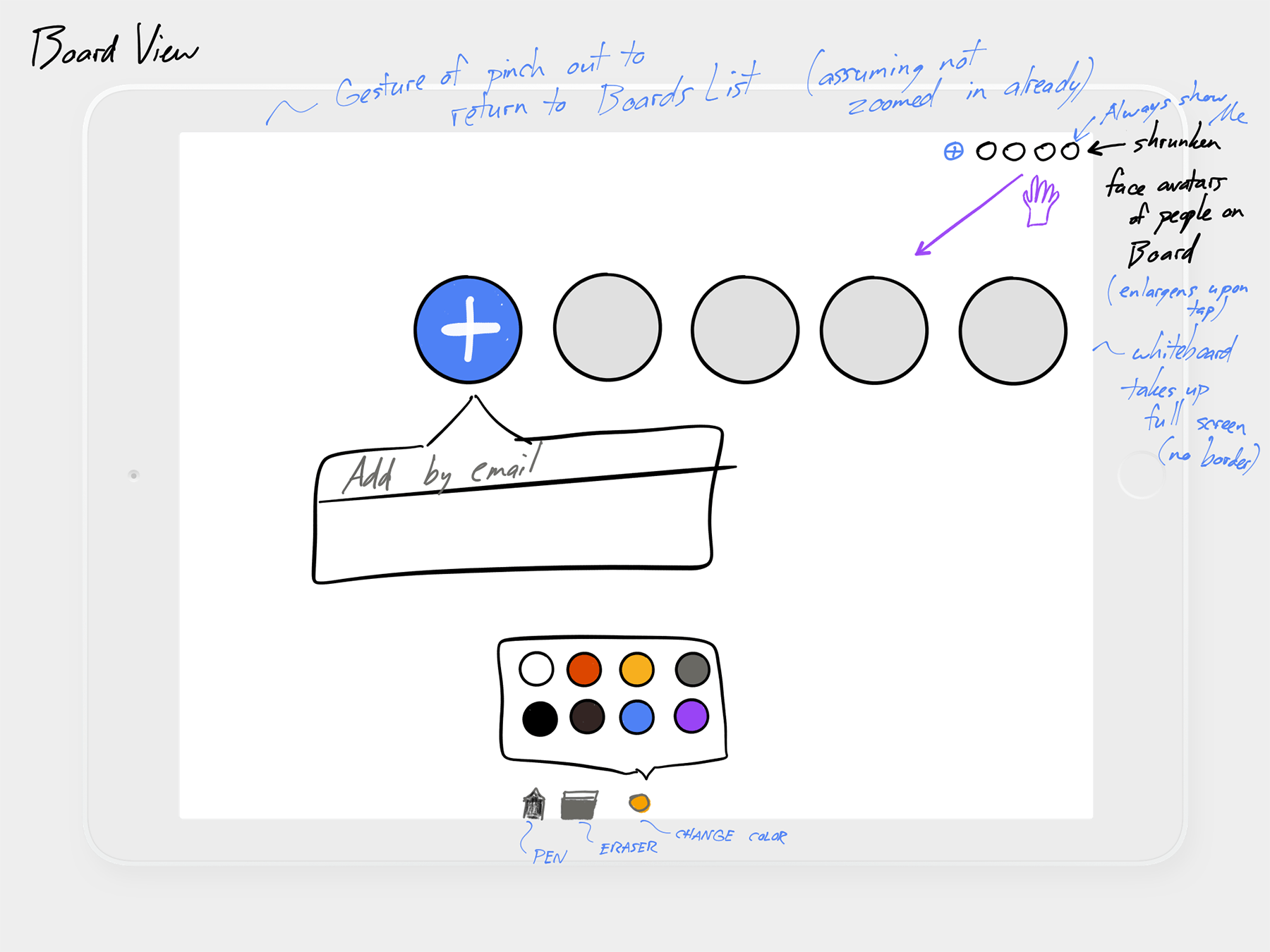
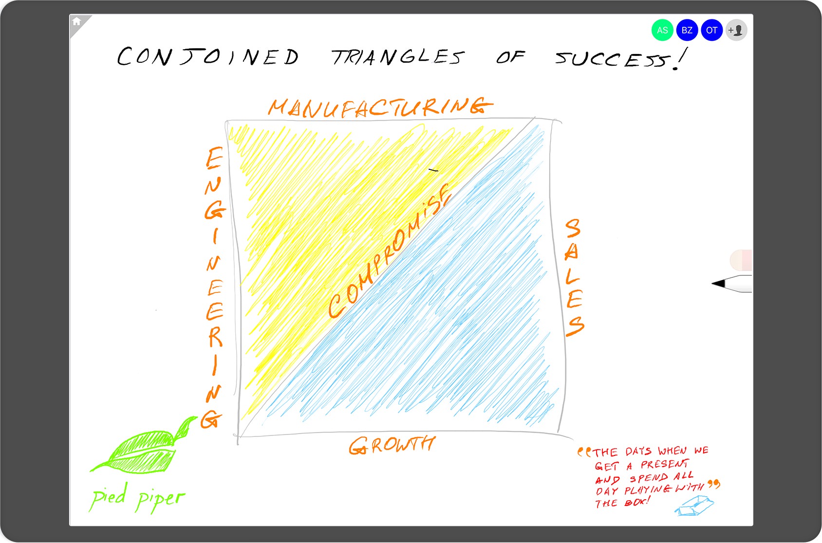
Logo and Brand Identity
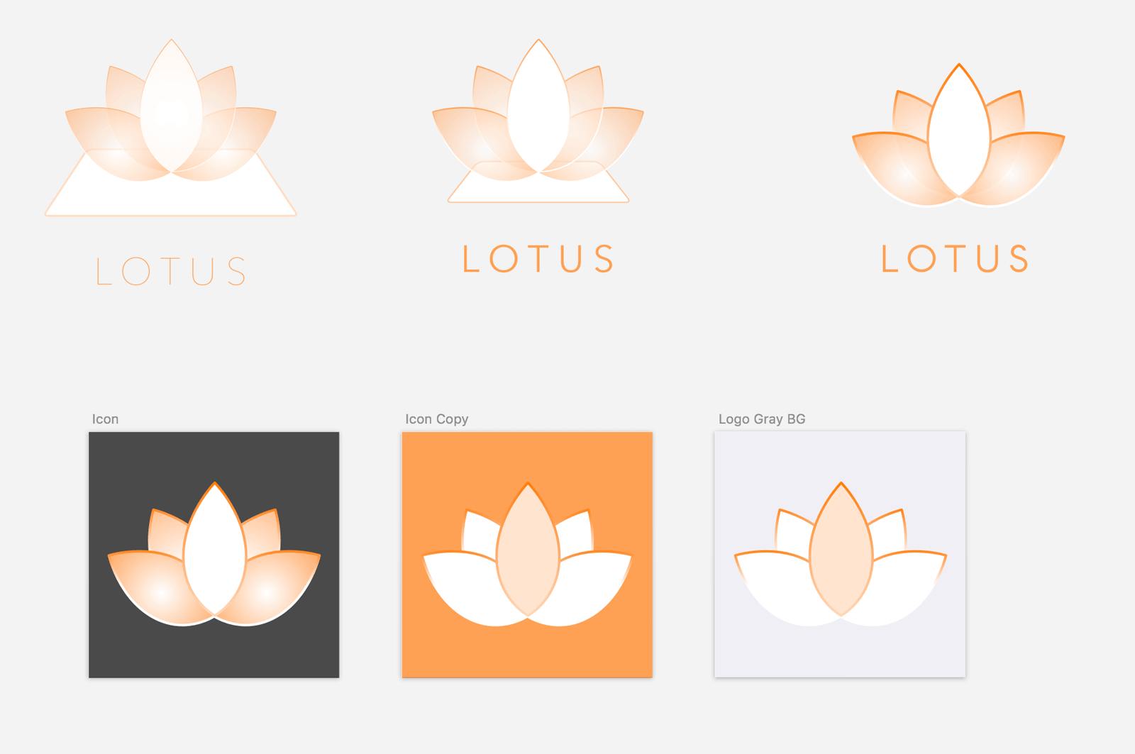
We came up with a huge list of product names, from the mundane ("MindSlate", "LiveSlate", "Synergy") to the empty vessels ("Coconut", "Cauldron", "Igloo"). Eventually, we settled on the name "Lotus." The name suggested the purity of a white lotus, much in the same way that a collaborative surface starts as a pure white canvas. From there, I worked to design the logo, exploring different representations of a lotus flower while trying to keep the shape simple and reproducible. I settled on the free type face Arcon for the logotype and brand text, which provided a minimalistic and elegant type treatment.
Results and Release
We got Lotus approved by Apple in the summer following the hackathon and released it to US audiences via the App Store. We had a small but loyal set of paying customers for a period of time, but after a few years sunset the app. It is now offline, but it was clearly getting at something important, as Apple eventually released their Freeform app, which uses the Apple Pencil for collaborative whiteboarding.


