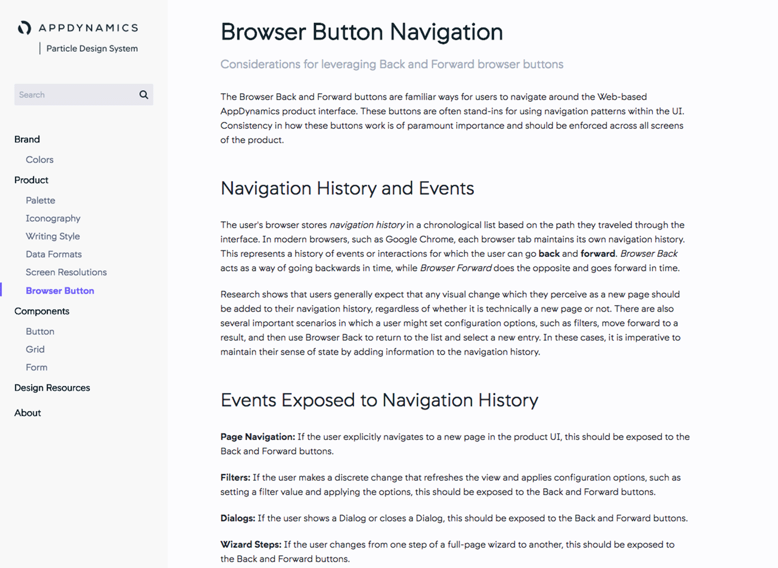
2017-2022
Particle and UI Kit
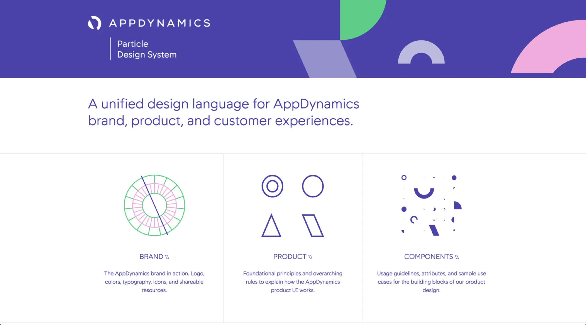
Particle is the UI/UX design system used for the entire product suite at AppDynamics. I founded the Design Technology team at AppD, led the design, partnered across the company, and rolled it out to Product teams. After Particle's launch, I transitioned into the role of Product Manager for its implementation.
MY ROLES
Interaction Design, Prototyping, Documentation, Team Leadership, Vision, Product Management
COMPANY
AppDynamics (Cisco)
Introduction
Early in my career at AppDynamics, I worked with Linda Tong, the VP of Experience, to create AppDynamics' first design system. I named it Particle. The design organization was small but growing, with an expanding product that had been built in a very piecemeal fashion. A design system felt like the most powerful way of standardizing user patterns, improving the efficiency and consistency of our engineering efforts, and ultimately creating a better user experience. A new product was also on the horizon. And thus Particle was born.
Particle would include three major elements:
- Product and Engineering components based on design specifications. We launched the system with 33 components, ranging from bread and butter UI controls to multi-step wizards and form patterns.
- Design-led style guidelines, including typography, colors, icons, and common page templates.
- Brand guidelines and assets, including logos, typefaces, presentation templates, and email signatures. Eventually this got moved into a dedicated Brand library, but it helped to standardize and share these critical assets across the company.
My first step was to build up a 7-person Design Technology team to serve as the stewards, prototypers, and decision makers of the system. I also partnered with Product Design, PM, Engineering, User Research, Information Development, and Marketing leaders to build and evangelize the system. During this time, my role was to manage the efforts of many people, but I also got down and dirty with identifying and documenting some of the most critical components. Finally, I worked hard to gain executive buy-in up to the CEO of the company through a series of roadshows and all hands presentations.
This was a roadshow presentation I gave to the AppDynamics Engineering organization in 2018 to garner support for our efforts.
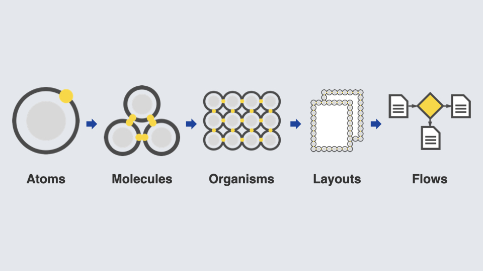
Atomic Principles
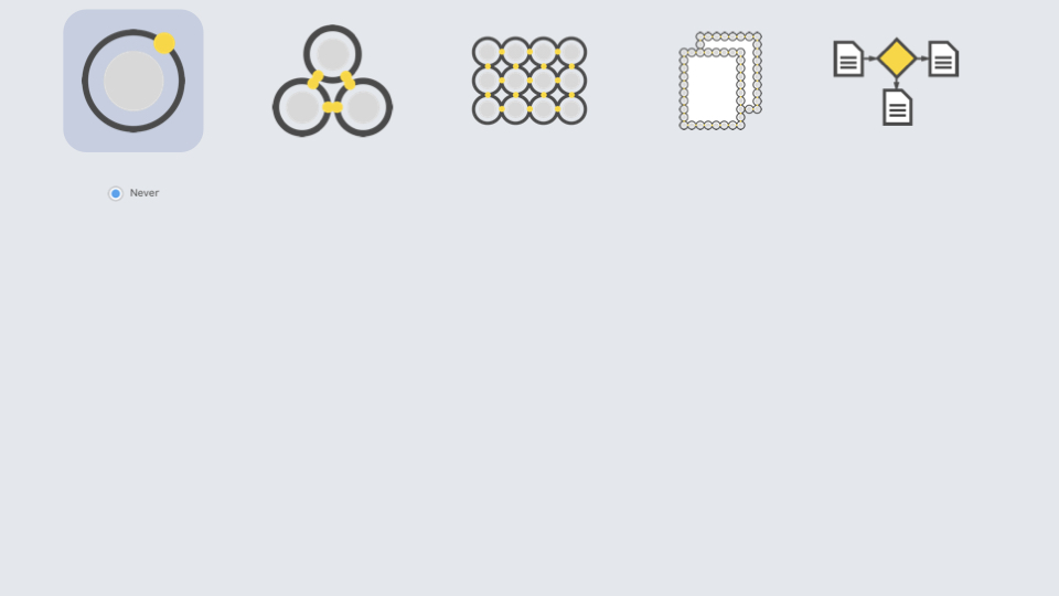
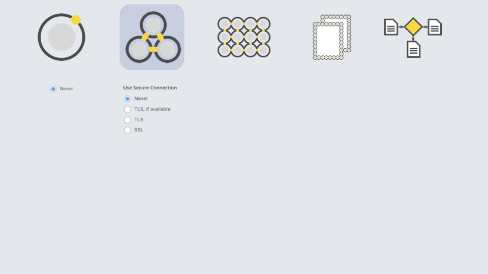
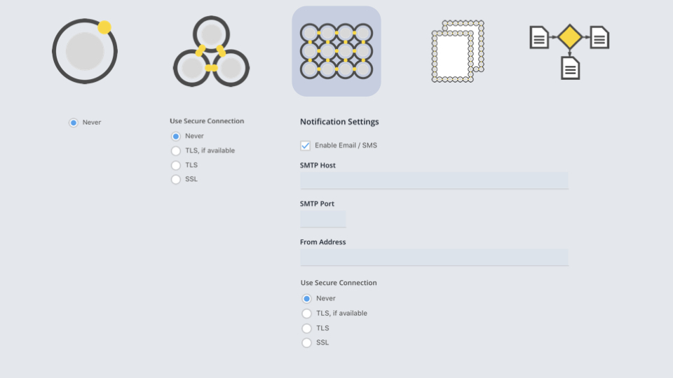
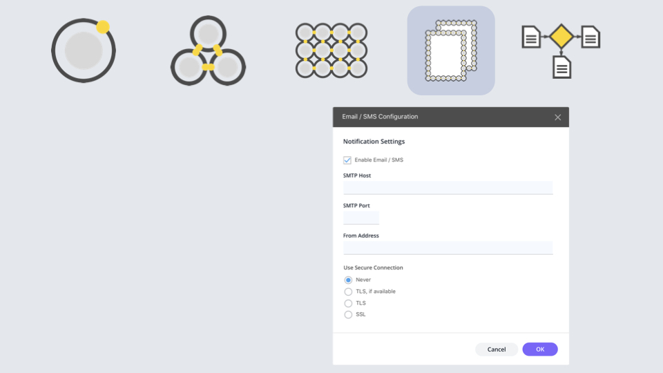
I introduced the team to Brad Frost's Atomic design principles for the organization of the design system. We created components for basic buttons, form controls, content containers, then progressively moved up to form layouts, modals with embedded layouts, and eventually entire page layouts. Every component was backed by documentation, examples, and supporting design files for Sketch and in time, Figma.
Launching the System
I was fortunate to be supported by a great team of people, and we all pitched in to catalog the components and prioritize them based on the needs of our internal customers, chiefly the designers and front end engineers creating the product. The design and definition of the system and its 33 components took about 8 months. Our partnership with the UI engineering organization allowed us to embed Storybook interactive artifacts into the design system website, which provided a demonstration of the component and the many properties that could be changed. Within a year, we had established an open contribution model in which teams could contribute their components back to the larger system. Even though some teams had to spend some months refactoring their codebases to convert to the design system components, my initial sales pitches of the efficiency gains and user benefits helped teams achieve buy-in with all their stakeholders. I feel very proud of the multidisciplinary approach I instilled in the project from its inception.
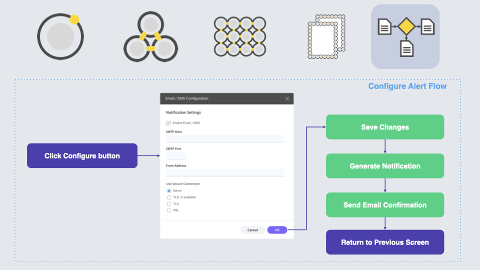
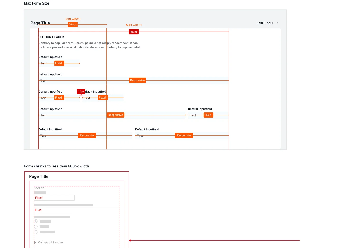
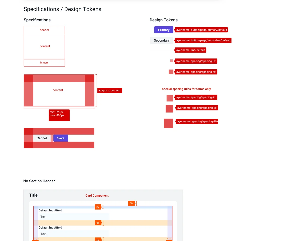
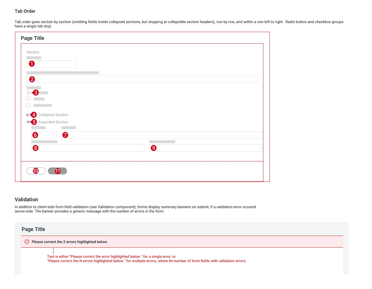
Here's one example of Form component specifications, which started as a guidelines document in Sketch and later made it to Angular and React components built by the Engineering team.
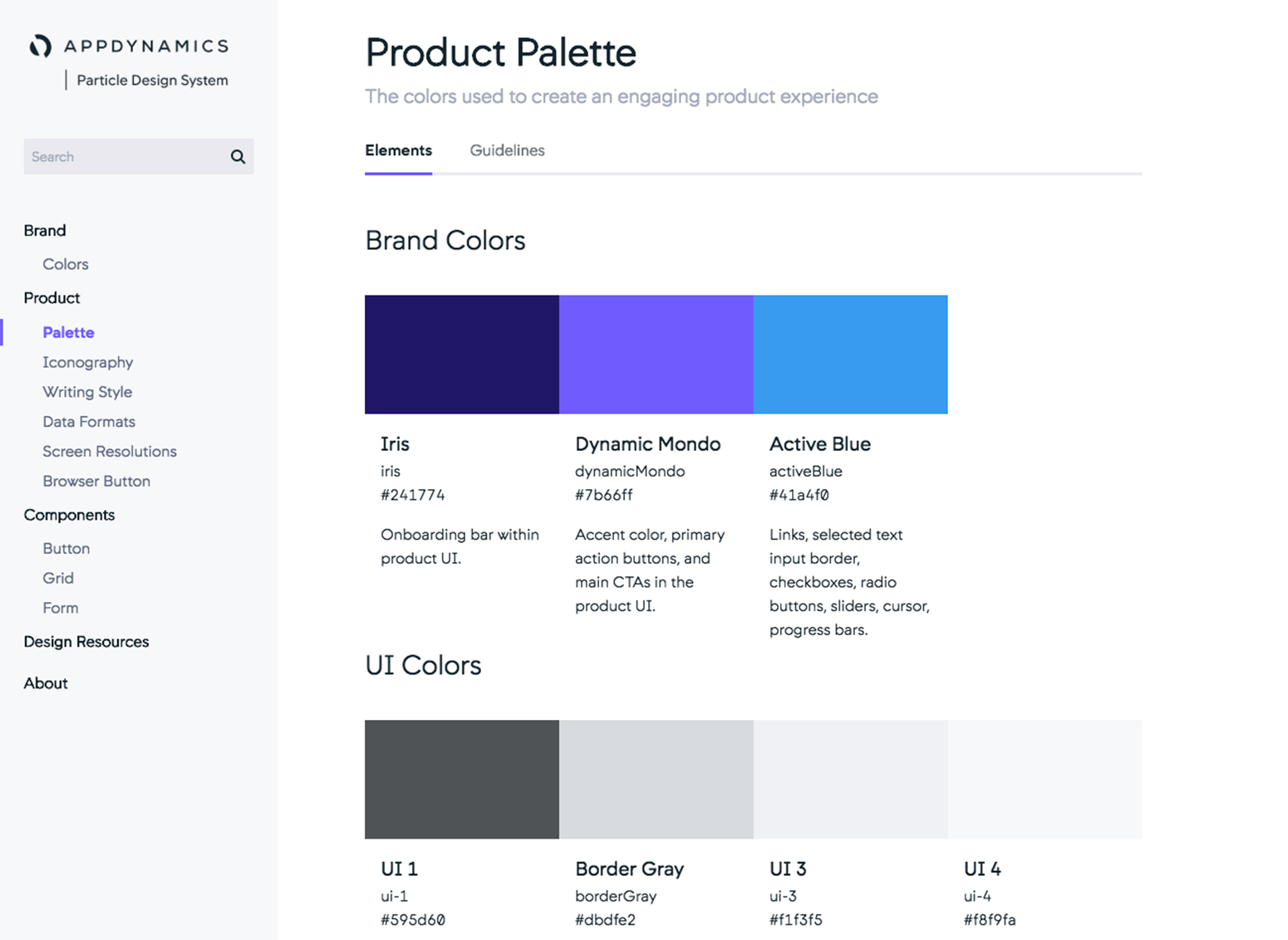
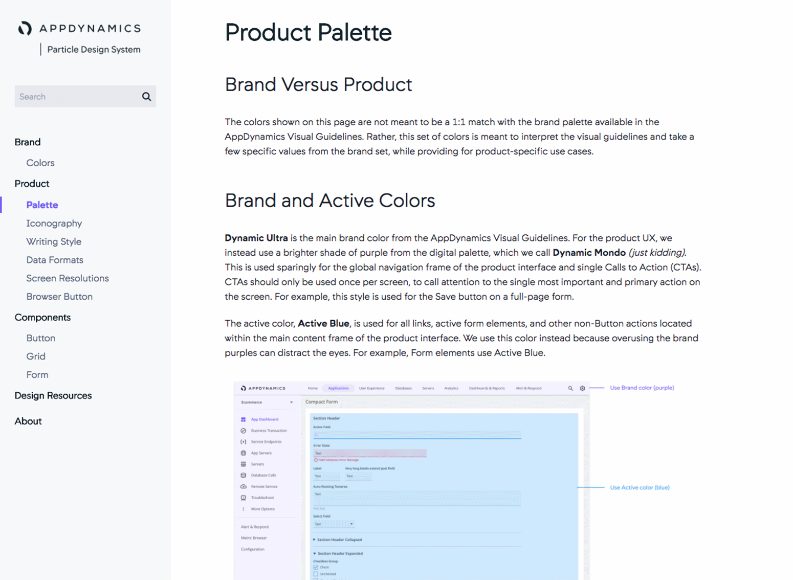
We created design tokens, variables that could be used in the design system for color, type, and spacing variations, for each component.
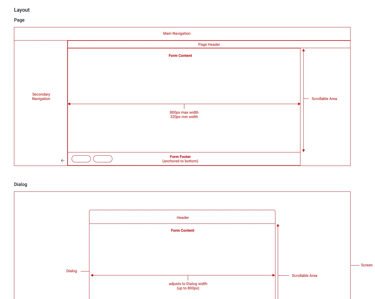
Layout diagrams and basic scroll behaviors were shared with the guidelines of Forms, as this was a higher-level design pattern (a "molecule", per the Atomic Design principles) that could also be included in higher-order components such as modal windows and page layouts.
Moving to PM
About six months after the debut of Particle, I got an itch for a new challenge. An opportunity opened up to fill the vacated position of Product Manager for UI Kit, which was the Engineering implementation of the internal Particle system. So I decided to hand off the team to another colleague and make a full transition over to PM.
My first goal was to straighten out the prioritization of Engineering work. Requests were coming in from teams all across the company for new design components and variations, and the centralized UI Engineering team was finding it difficult to focus on the most important things. Partnering with the Director of the org, I defined a scoring system for the scope and importance of all of the UI components, as well as global requirements for performance (e.g. page load time) and accessibility (e.g. keyboard shortcuts, tab orders). I ranked what needed to be built and created initiatives, epics, and user stories. In some cases, the initial specifications from the Design Technology team needed to be reworked. Meanwhile, I asked a small, dedicated team of UI Kit engineers to construct a library for charting and data visualization, which expanded the usefulness of the integrated system.
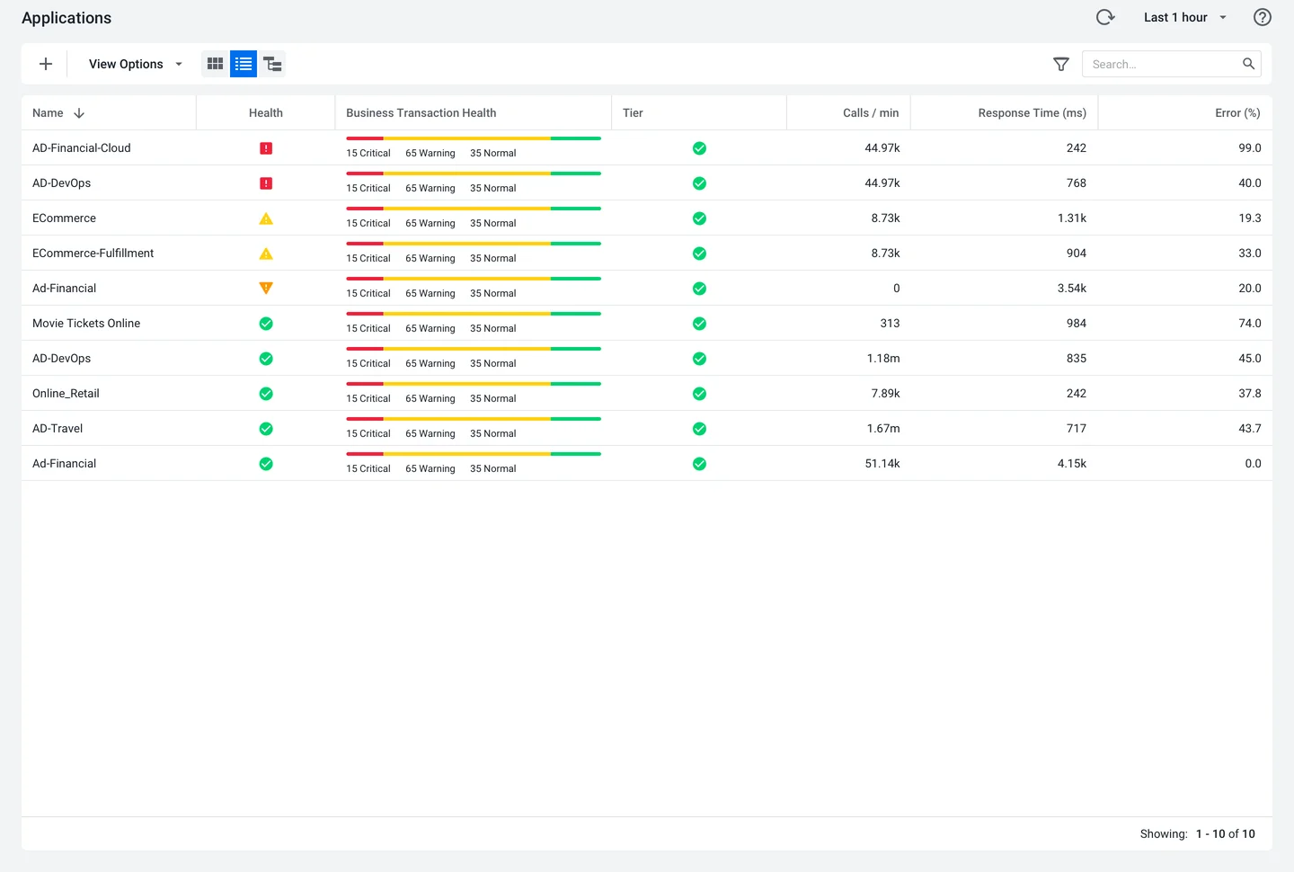
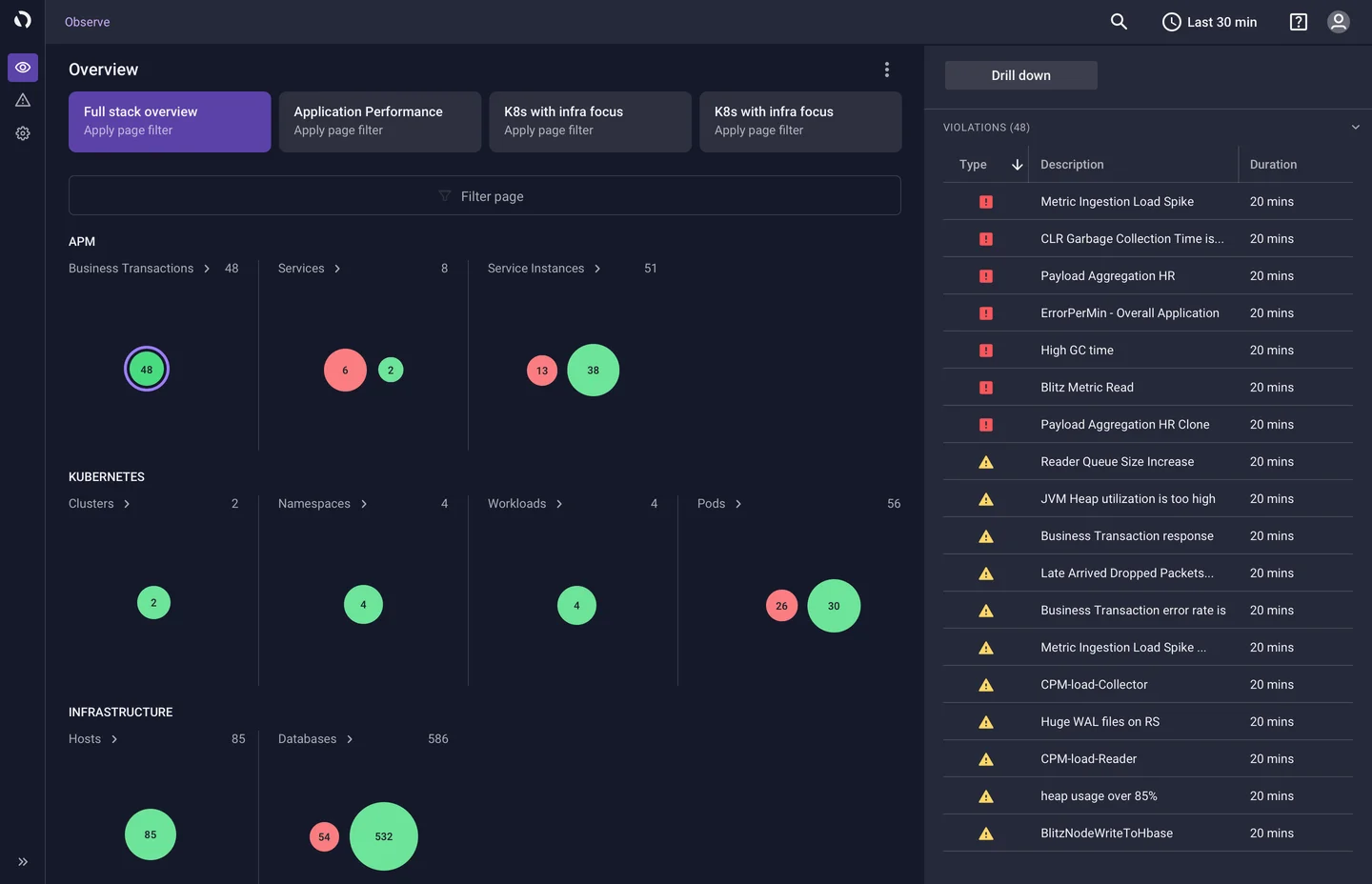
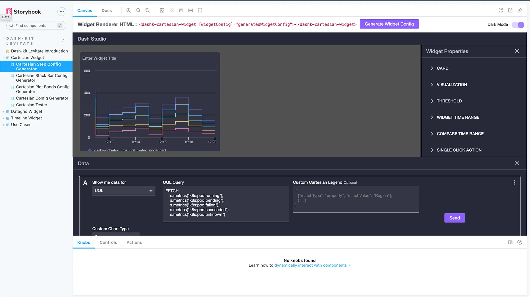
UI Kit components are illustrated for front end engineers using Storybook. This is an example of chart dashboard components implemented in UI Kit, based on Particle specifications.
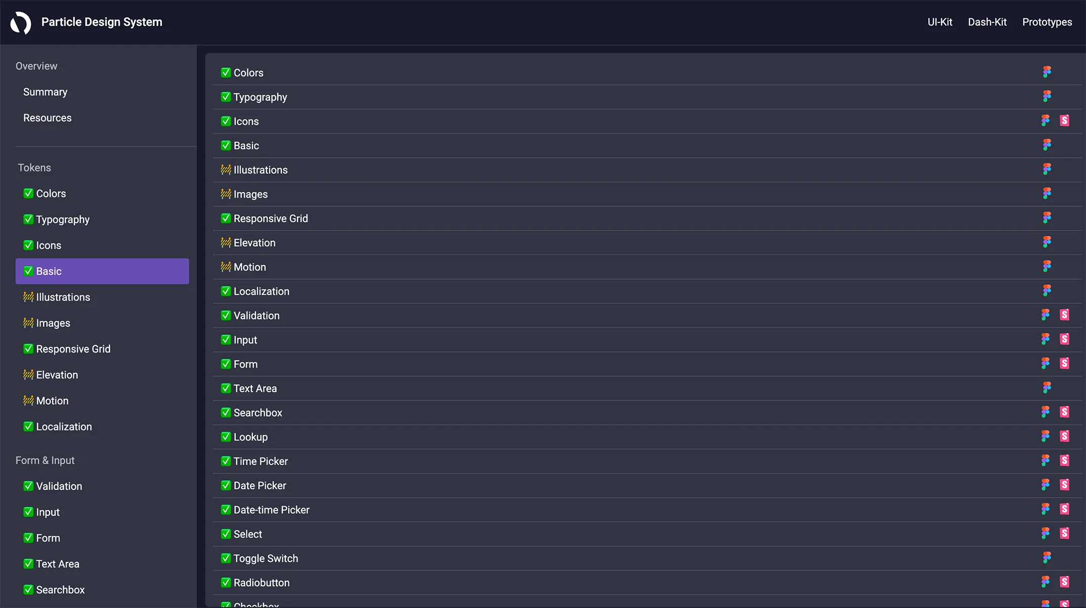
For front end engineers, we also provided a single code site with all the UI Kit components, which cross-linked back to Particle specifications.
Results
- Launched a system of 33 (eventually around 40) UI Kit components with well documented guidelines, use cases, and property variations through the Particle Design System. The initial version of the system was rolled out to internal teams within 8 months.
- Achieved 100% penetration of design system guidelines in the AppDynamics UI within 18 months. The system was adopted by more than 15 product teams.
- Changed the overall UI theme of the AppDynamics product (covering about 110 distinct screens and workflows) to match the new design system guidelines.
- Implemented an open contribution model and solicited input for new and revised components from Engineering organization.
- Conducted dozens of customer feedback sessions related to the look and feel and usability of the product.
- Implemented global accessibility and UI performance guidelines to improve the usability of the AppDynamics product.
Key Takeaways
- This was my first official Product Manager role, even though I had performed the duties of a Product Manager at BMC and other companies in the past. Working on this project from this new angle taught me the critical elements of effective product management and set me on a path for leading an organization of PMs myself.
- Partnerships with key people, such as the Director of UI Engineering, the Head of Product Design, Lead Program Manager (once we had one), and Brand Creative Director were critical to understand and rank the needs of our internal teams and make the system as impactful as possible.
- My initial vision of having a Brand system within Particle turned out to be overly ambitious, and that team wanted closer ownership of their brand assets. So eventually they moved out of Particle, allowing us to focus it entirely on Product and Engineering.
Acknowledgments
I want to thank Eric Wienke, Rob Riccetti, Joe Angeles, Shy Dhanani, Ian Lin, and Andrew Hock for their work with me on the Particle Design System. From the Engineering side, Albert Chang, Olivier Crameri, Yin Li, and Jake Bassett were instrumental partners, as well as Dinesh Rajwani and Harrison Ng from Program Management. Linda Tong was my key executive partner and helped drive support for the project from the beginning. Finally, I wanted to send a cosmic thank-you to the late Rachel Reynard, who led Product Design at AppD and was my close partner in promoting and expanding the system's use.


