2014-2016
Smart IT
Smart IT is a rethinking of the IT Service Desk. Smart IT helps IT agents—working from an office or on the go—determine the problem a customer is having, research knowledge articles to figure out a fix, and address the issue quickly and accurately.
MY ROLES
Interaction Design, User Research, Prototyping, Product Strategy
COMPANY
BMC
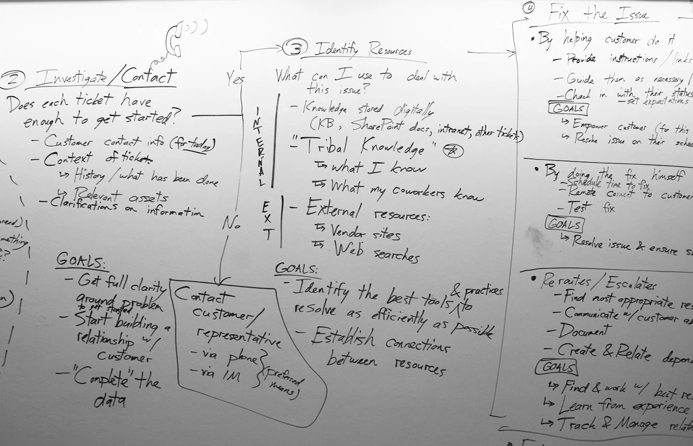
Opportunities from Observations
Six months into my time at BMC, I was asked to be part of a vision project to learn about the current state of the art in the IT Service Management (ITSM) industry. BMC had a dominant product, Remedy, that had fallen out of favor due to dwindling innovation and dreadful user experiences.
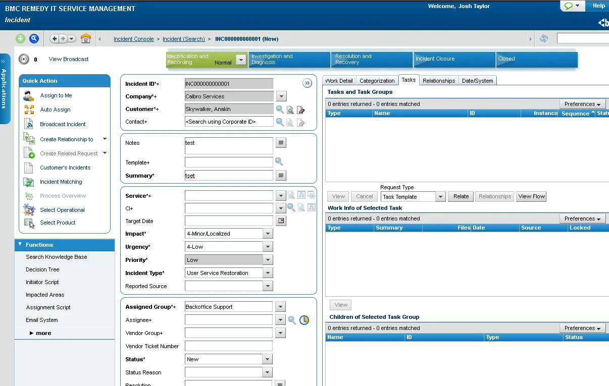
Out in the field, we discovered teams of IT agents fighting with their tools. Remedy and competing products were seen more of hindrances than assistive tools. Agents—people who had gone into IT to help people solve problems—were constantly distracted from their work by clunky and slow interfaces. Post-it notes with reminders and gotchas were pasted around the bezels of monitors. Binders filled with training materials were piled up on desks, never to be touched by time-strapped agents. And most revealing of all, many agents would start by typing details of customers’ issues on Notepad, only to go to Remedy and log tickets about the work at the very end of the process. Clearly, there were many opportunities for improvement.
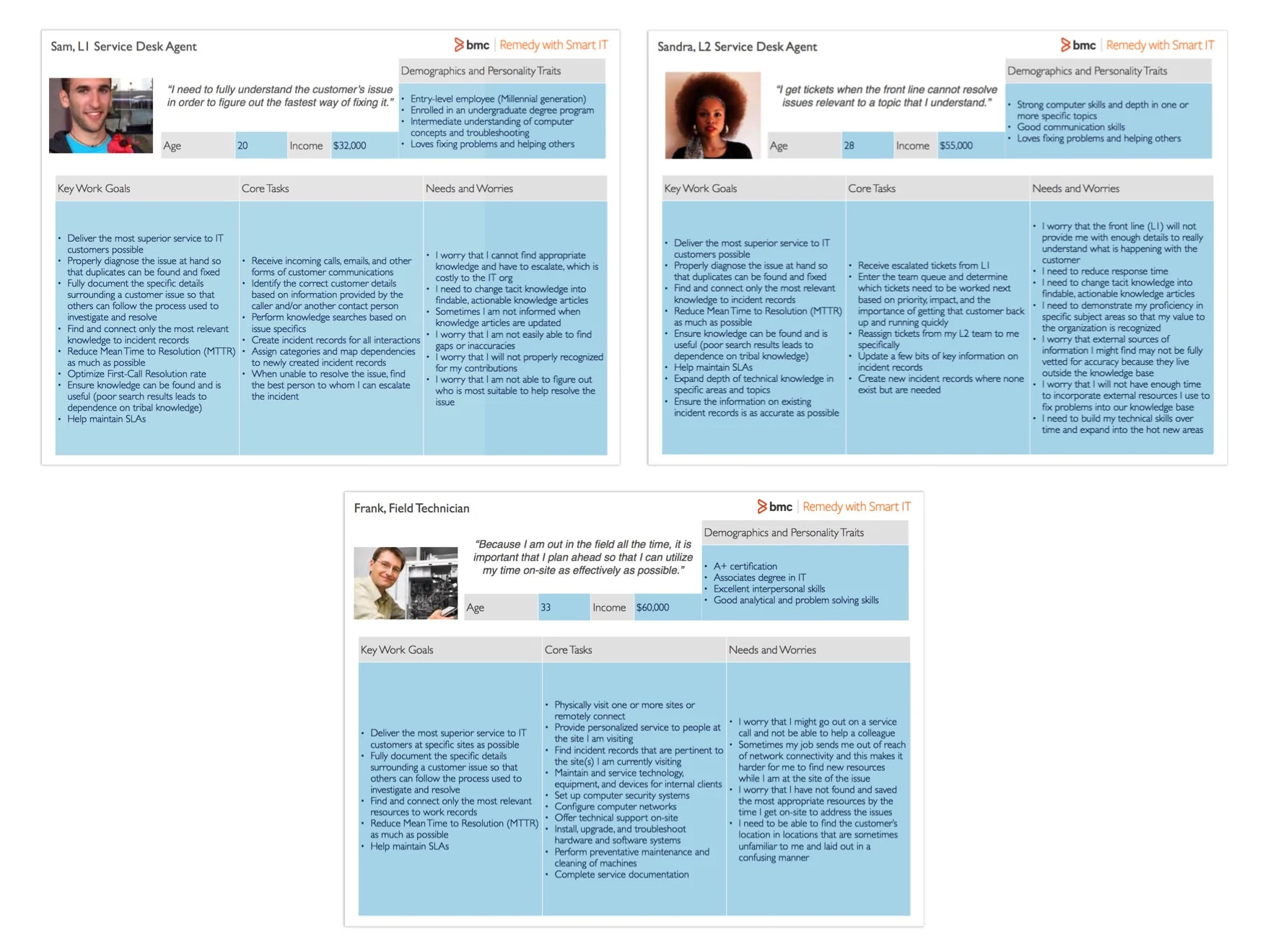
We conducted several weeks of contextual inquiries with large and small customers. From this work, we developed three main Service Desk personas as the targets for the first phase of whatever this project would become.
Design Principles
Based on our user research, we also started to see some recurring themes and pain points emerge. Through a series of design workshops, we synthesized these into six design principles.
Contextual: Instead of requiring agents to spend time researching the customer's past history, the system should draw from a rich database and surface contextually relevant information.
Proactive: Instead of depending on direct actions of agents for every issue, the system should provide automations that can take action on behalf of the Service Desk to fix common issues Before they are even reported.
Insightful: Instead of requiring staff to sift through mountains of tickets and data in “free time,” the system should recognize recurring types of issues and provide options for dealing with common known issues based on past successes.
Flexible: Instead of forcing agents to connect using laptops or desktop computers, the system should work across devices and provide mobile solutions for agents on-the-go.
Connected: The system should encourage natural collaborations between Service Desk agents so that they can help one another and inform each other when they need help.
Rewarding: The system should encourage agents to use it through the conveniences of modern user experiences and allow them to build skills profiles that tie into career development goals.
Before & After
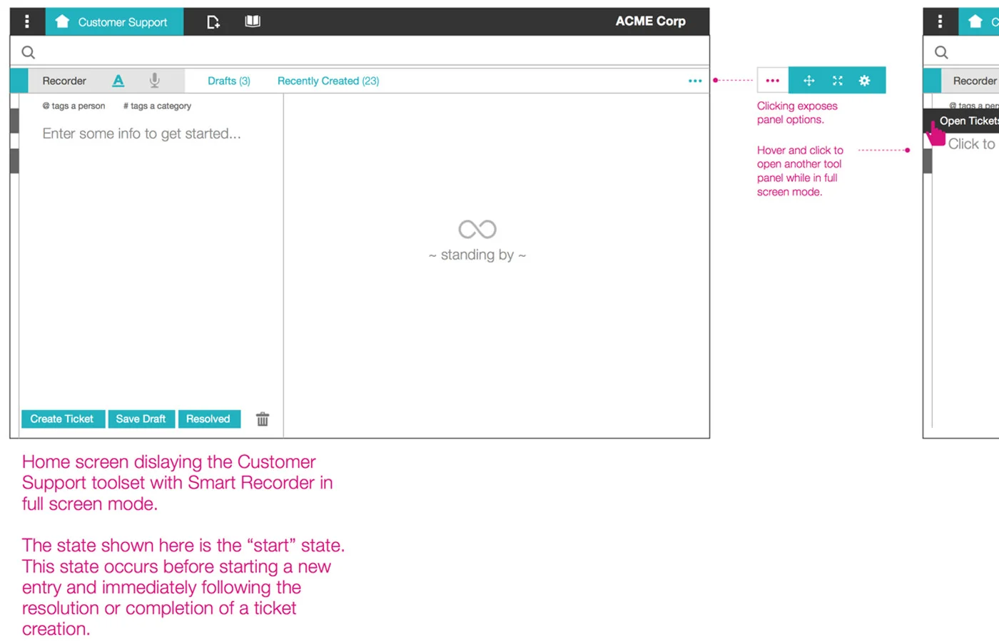
Smart Recorder
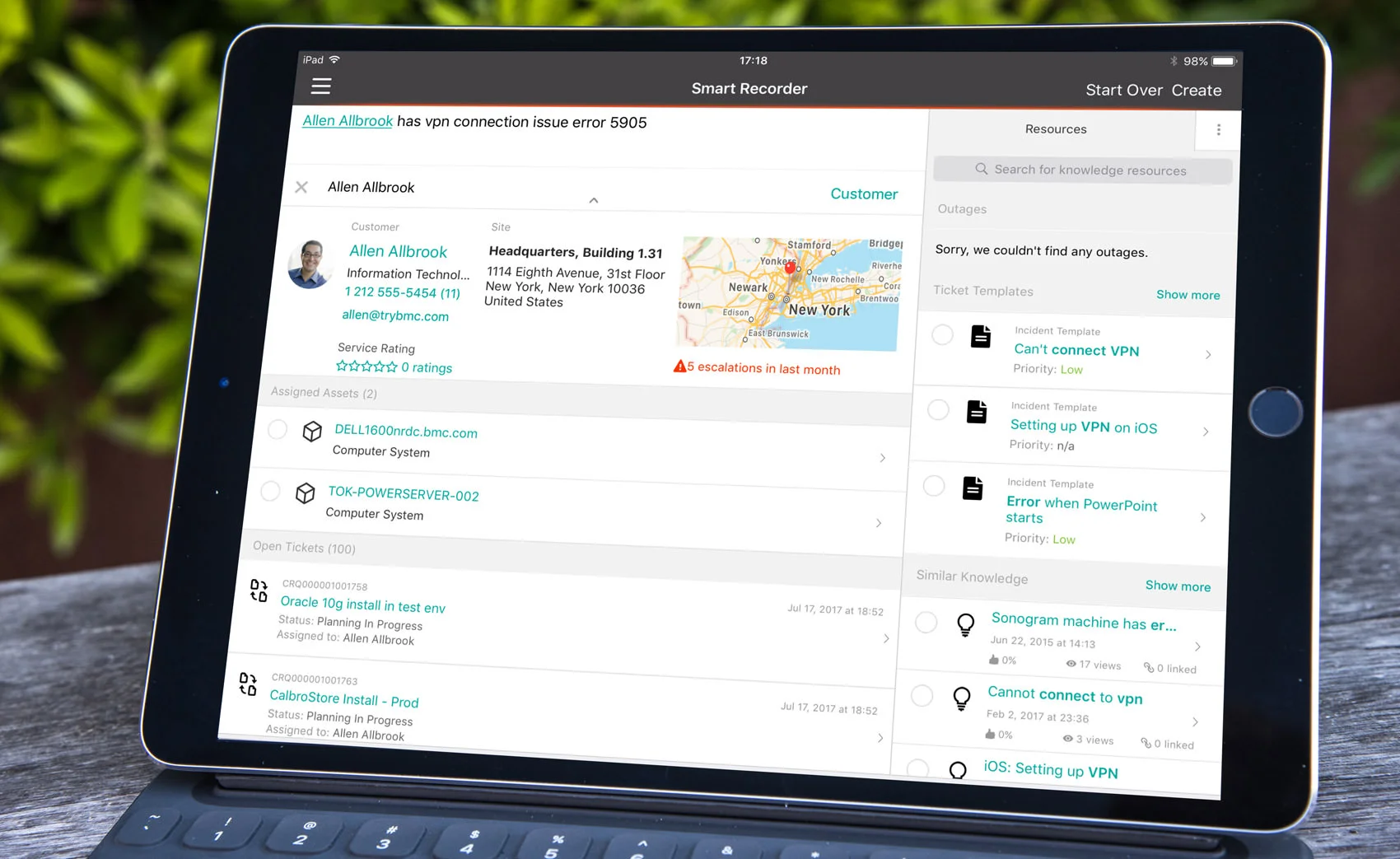
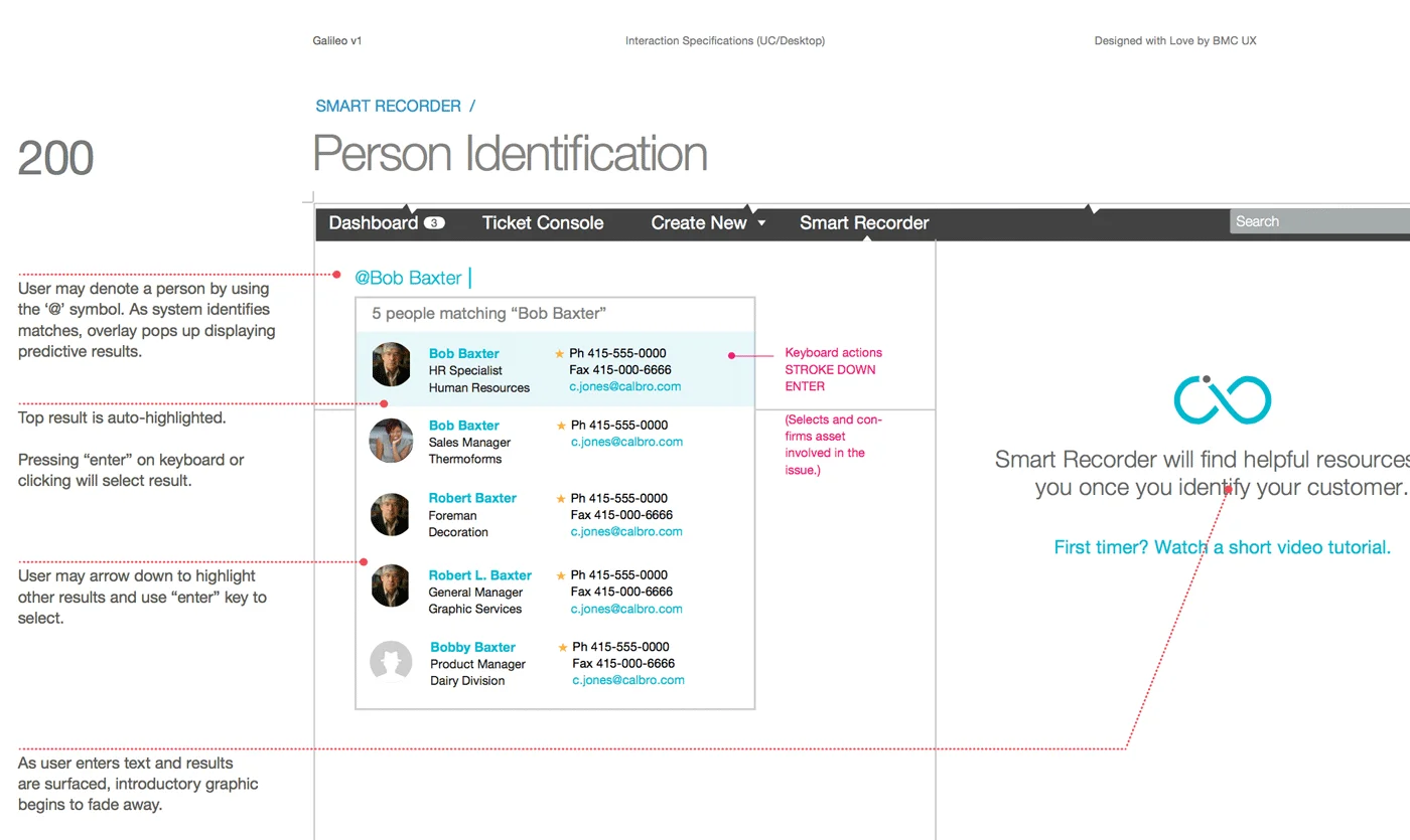
Seeing agents type basic information about their customers and their IT issues and later copy all of that into Remedy tickets made it clear that there could be a better solution. ITSM tools are usually form-based, meaning that agents need to match up their thought processes with a rigid series of ticket fields. This process usually led to incomplete or inaccurate inputs and increased the time to resolve issues.
What if agents could just describe the issue and never have to worry about filing tickets? This premise stuck with me and later became the driving spark behind Smart Recorder, an assistive interface that surfaces contextual information about the customer’s past tickets, provides access to knowledge resources from the same screen, and even suggests courses of action for expediently addressing the issue.
We drew out the happy path and alternate paths for registering and solving IT issues based on our user visits.
The first layout used a two-column arrangement where the user types on the left and sees relevant results bubble up on the right.
When the interactions proved too tricky to figure out with the two-column layout, I sketched out a three-section variant to launch the feature in time.
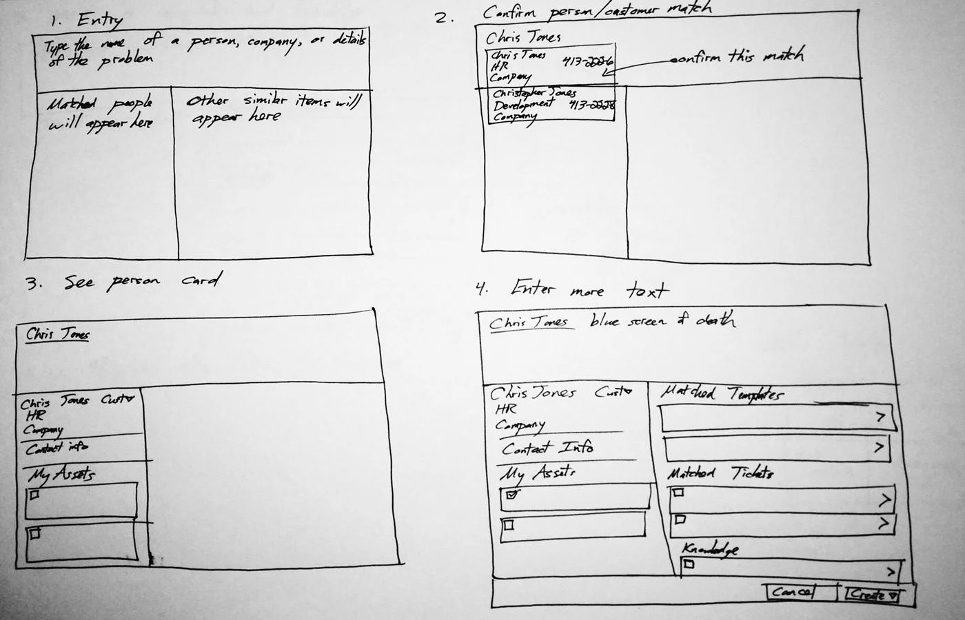
Bringing all of this functionality into a simple experience took many iterations to get right. The customer needed to be identified in order to seed all search results, so I designed a flow that first required the customer to be found via search. Another issue was the layout—while we started with a two-column design, this raised many interaction issues and required the agent to toggle between multiple layers. I worked with our engineering team to prototype a new design with three main sections, which ultimately stuck through to the shipping feature.
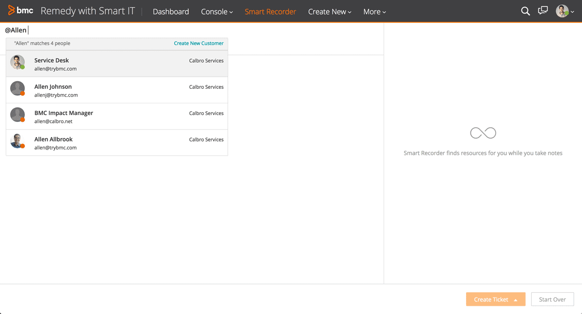
The customer is first identified via a flexible search of name or email address. Once the customer is identified, his or her contact information, IT assets, and past issue history are displayed below.
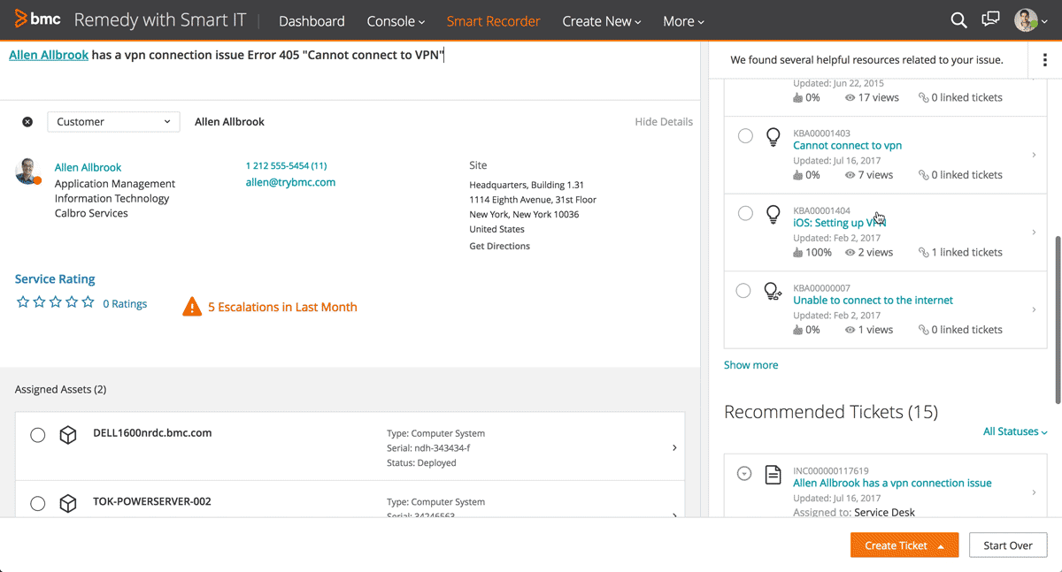
Knowledge resources are surfaced based on what the agent has typed into the notepad field. When an article is clicked, the screen slides over to show an inline preview.

When the agent finds a helpful knowledge resource, it can either be saved to the ticket or used to automatically generate a ticket and mark it as the resolution for the IT issue.
Before & After
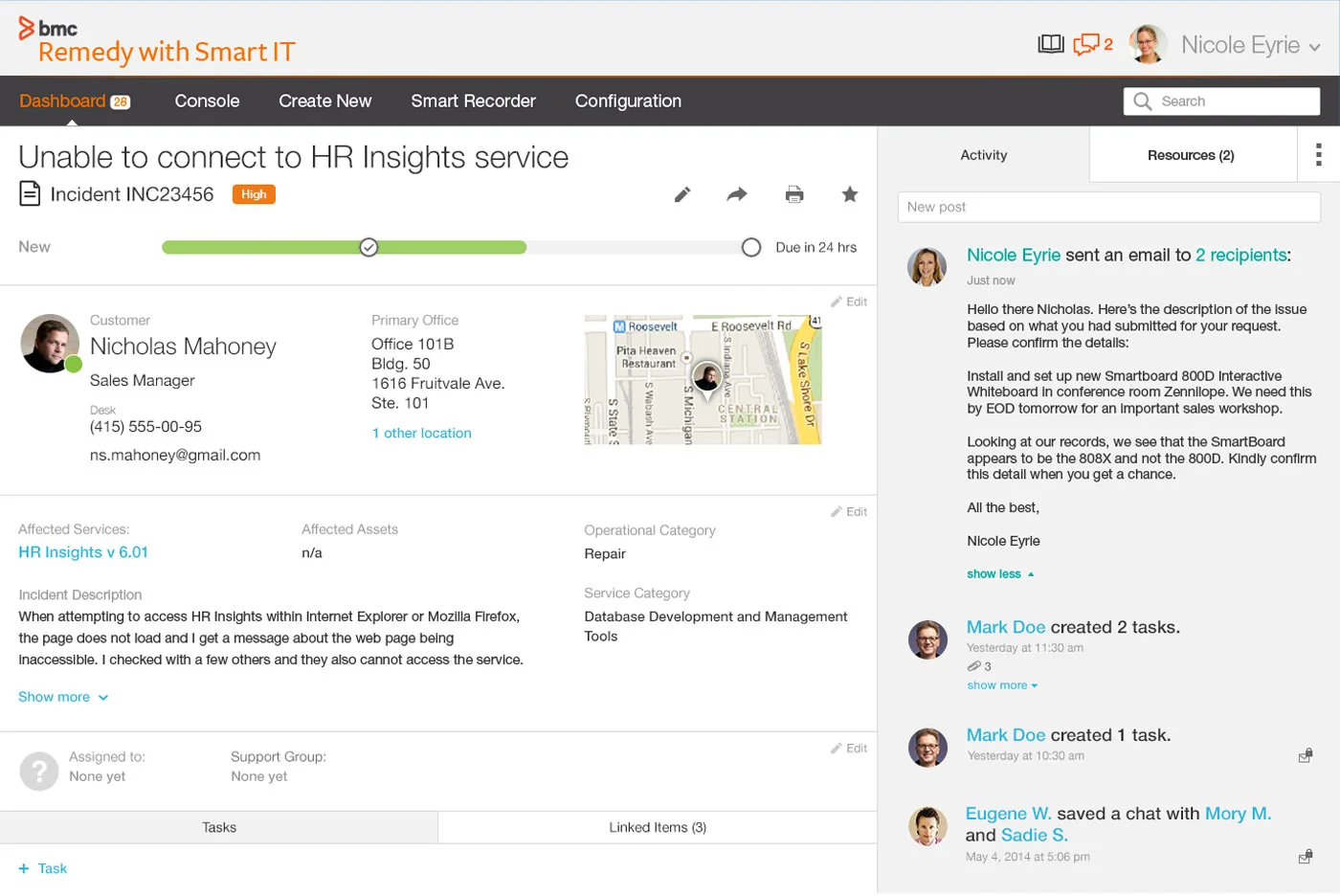
Ticket Views
Despite the limited amount of time for this early design work—just a few weeks’ time—we poured through mountains of ideas for how to present and display ticket information.
A desire to show the chronological history of a ticket morphed into the Activity Stream, a fundamental piece of all tickets that resides in the right column of the layout. Resources were another big part of the product vision, providing the ability to "pin" helpful knowledge articles and similar issue tickets to an incident so that they could be pulled up later, all without having to spawn a popup window or dialog box.
Before & After
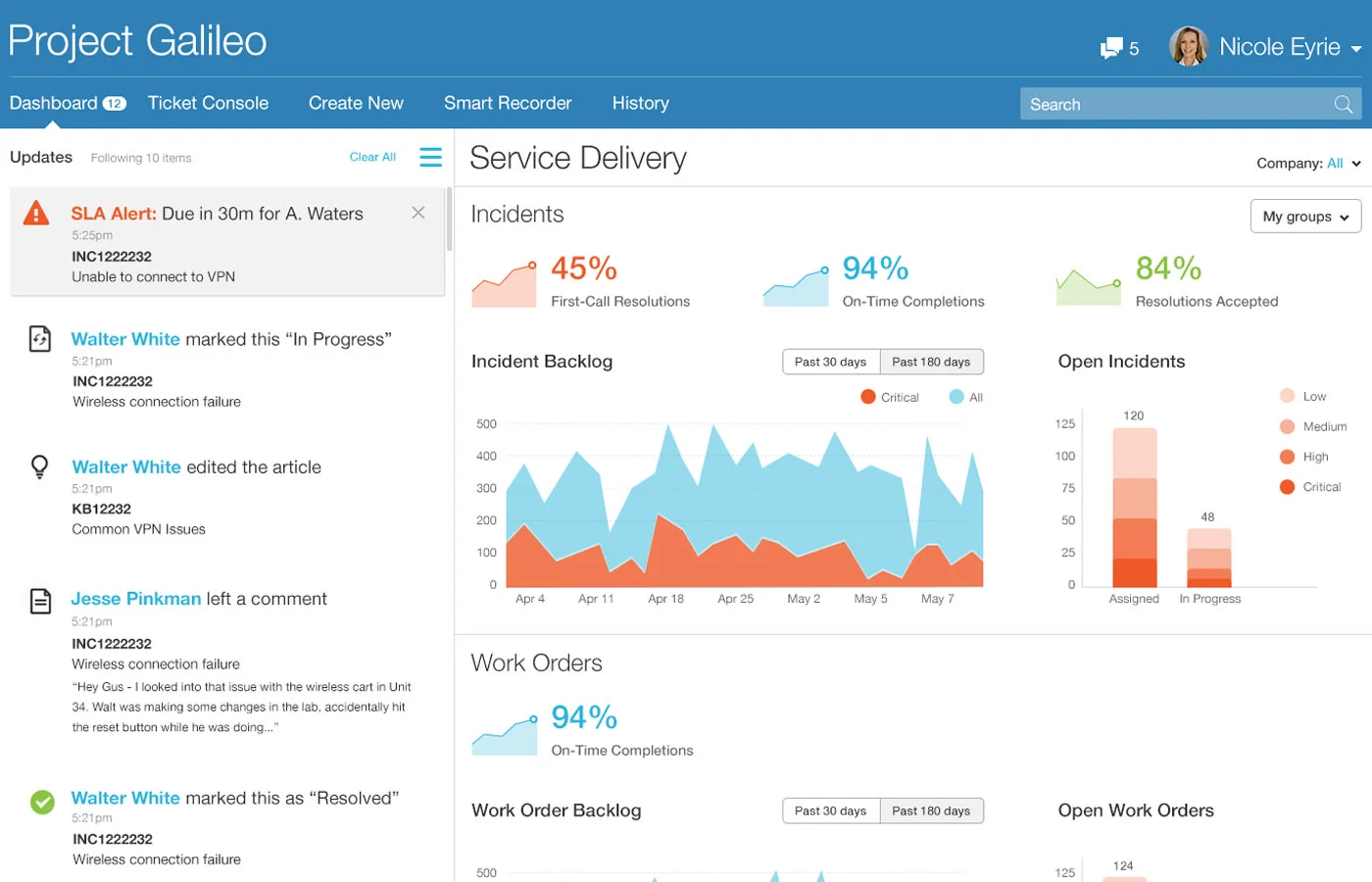
Dashboard
We tested multiple concepts for what to show to agents when they first entered Smart IT. Traditionally, ITSM tools would show some kind of dashboard of meaningless charts intended more for executives than the Service Desk. I saw an opportunity to deliver workspaces and tools for each distinct persona, so that a Level 1 Service Agent would see different things from a Field Technician who is always on-the-go. Over time, we whittled the design down to a series of sections to show the health of the Service Desk.
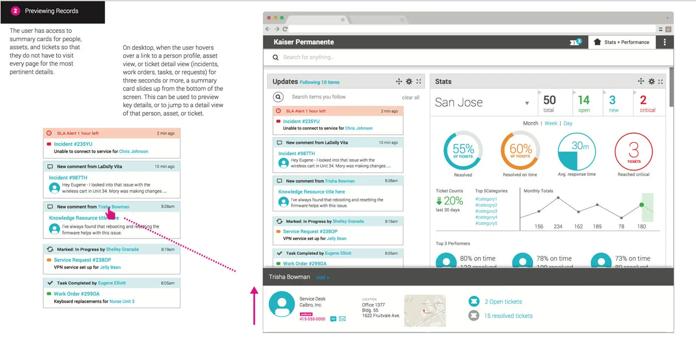
Users of the legacy Remedy system complained loudly about having to slowly load the ticket views, so we experimented with ways of previewing tickets directly from the Dashboard.
Eventually, the Dashboard evolved into a persona-driven set of tools that could be rearranged and customized by the logged-in Smart IT user.
There originally was a Stats-focused perspective of the Dashboard. As the schedule grew tighter, we ended up going with this as the sole Dashboard.
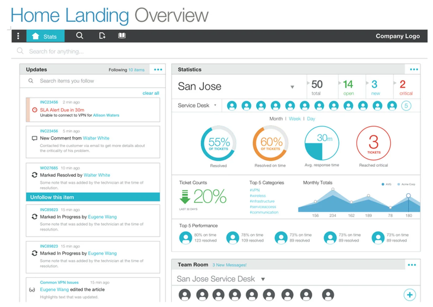
We tried to pick visualizations that would be most relevant to our three target personas in the first release of Smart IT.
Building with R&D
At its height, the Smart IT team included our small design team and over 40 others—product managers, architects, developers, QA engineers, and documentation authors. We had about a month of lead time before R&D began their work implementing our designs.
To better facilitate working together, I pushed for a regular cadence of UX shareout meetings and a collaborative attitude towards the rest of the team. I scheduled working sessions between our designers, architects, product managers, and UI developer leads. These became a hallmark of the Smart IT design and development process.
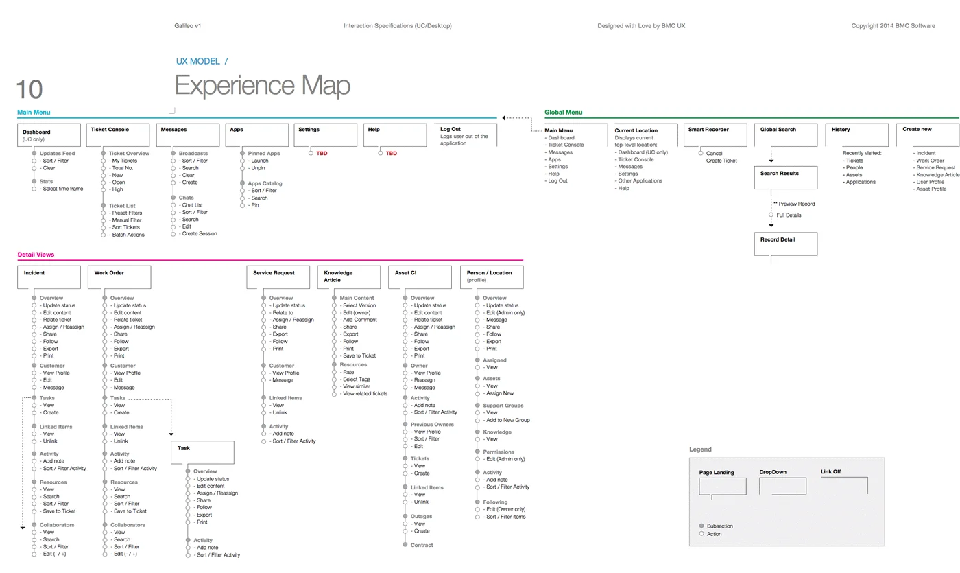
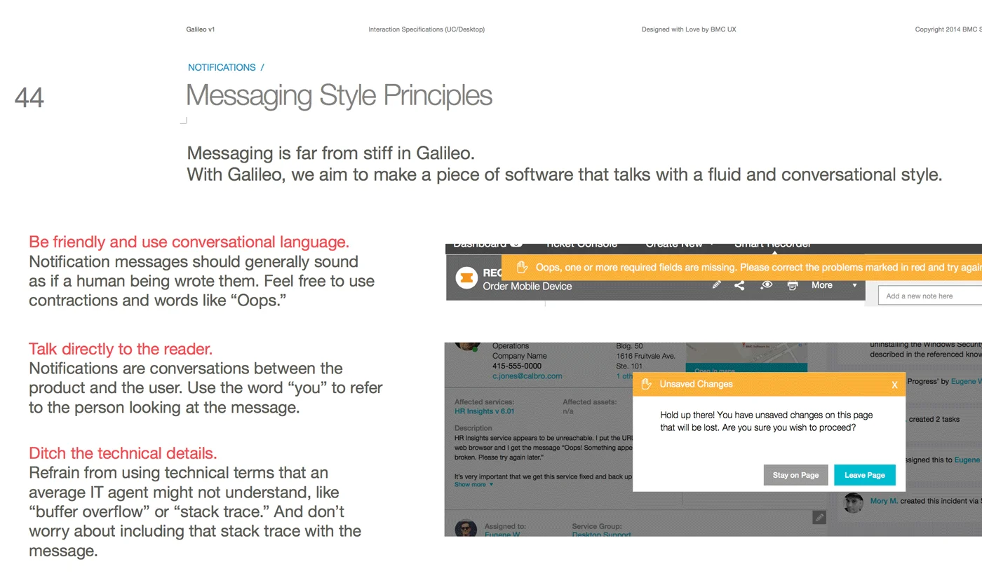
At the beginning of the project, we settled on using a UX spec document to share annotated mockups, icon libraries, and the design principles. This morphed into a gigantic, 500-page tome that quickly fell out of date. Frustrated by this process, I eventually moved the team over to using Sketch and InVision to share interactive prototypes for each Smart IT user story. This was a significant process improvement that later moved across to other BMC projects.
Shipping Smart IT
The development process for Smart IT 1.0 was less than six months. During that time, we designed the experiences for Web browsers, iPads, and Android tablets. The product managers pushed off the translation to smartphones to a subsequent release.
Benchmark testing conducted with the GA version of Smart IT 1.0 showed that when compared side-by-side with the legacy Remedy Incident Management UI, there was a significant decrease in the Mean Time Call Resolution. In the observed cases, Smart IT users were on average 79 seconds faster resolving calls, resulting in a 75% increase in productivity.
At BMC Engage in the fall of 2014, BMC officially launched Smart IT 1.0. The response to the product rollout was overwhelming, with many customers describing their excitement with the "new" BMC and the transformed Service Desk enabled by Smart IT. Smart IT continues to be a flagship offering from BMC and has become the cornerstone of the Remedy 9.0 ITSM suite of products.
Smart IT is like crack - once you start using it, you can't stop.
-- Smart IT Early Adopter at a Fortune 500 Customer
BMC Remedy's Smart IT user interface improves usability and flexibility, and demonstrates BMC's innovation in this market.
-- Gartner ITSSM Magic Quadrant, 2015